


MEDSEMBLY
MEDSEMBLY
MEDSEMBLY
January - February 2026
Fintech, B2C, web app
Product Designer

The Case Study in a Mighty Bento
The Case Study in a Mighty Bento
Because not everybody has time to read through the whole thing... Here’s the project in a bento.
Because not everybody has time to read through the whole thing... Here’s the project in a bento.
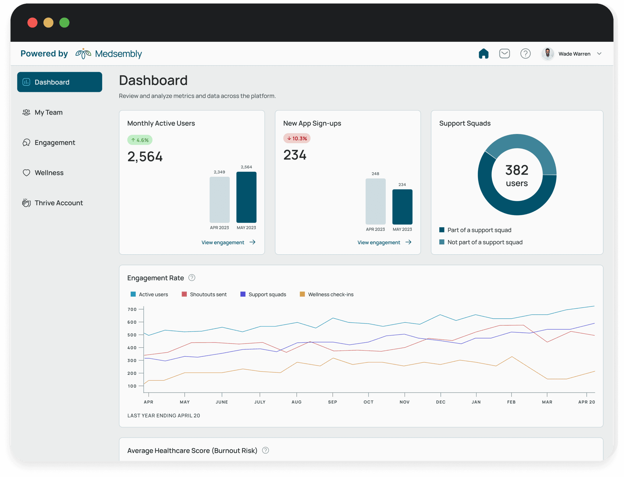
The Solution
Medsembly solves this by creating a dashboard which will help companies track their employees' healthcare journey and wellness through the app
The Solution
Medsembly solves this by creating a dashboard which will help companies track their employees' healthcare journey and wellness through the app
The Solution
Medsembly solves this by creating a dashboard which will help companies track their employees' healthcare journey and wellness through the app

Reduce Employee Turnover
In today's fast-paced healthcare industry, organizations are realizing the correlation between employee wellness and employee retention. Merely offering an employee app is not enough for employers; they need to understand insights into engagement levels and wellbeing trends.
In today's fast-paced healthcare industry, organizations are realizing the correlation between employee wellness and employee retention. Merely offering an employee app is not enough for employers; they need to understand insights into engagement levels and wellbeing trends.
Identifying the challenge
Identifying the challenge

Designing Data
Designing Data
The challenge is designing a dashboard that is easily understandable and digestible by the employers. It is important to show clear and concise data so that employers can take action to improve the wellbeing in the organization.
The challenge is designing a dashboard that is easily understandable and digestible by the employers. It is important to show clear and concise data so that employers can take action to improve the wellbeing in the organization.
Conducting research
Conducting research

Lack of Data Monitoring
Lack of Data Monitoring
Different healthcare institutions were interviewed to understand how the management is dealing with employee retention and what actions they're taking to manage employee wellbeing. From the interviews, it was revealed that although many healthcare institutions offer wellness programs to employees, they do not monitor any data related to these programs.
Different healthcare institutions were interviewed to understand how the management is dealing with employee retention and what actions they're taking to manage employee wellbeing. From the interviews, it was revealed that although many healthcare institutions offer wellness programs to employees, they do not monitor any data related to these programs.
Using a dashboard can include a steep learning curve for some users. Because of this, data visualization can potentially increase users' sense-making, allowing them to give focus on the overall message rather than the numbers (Perdana, Robb, & Rohde, 2018).
Using a dashboard can include a steep learning curve for some users. Because of this, data visualization can potentially increase users' sense-making, allowing them to give focus on the overall message rather than the numbers (Perdana, Robb, & Rohde, 2018).
Insights from Interviews and Research
Insights from Interviews and Research
Based on the information gathered through interviews and research, the main design challenges are the following:

Data Overload and Complexity
Data Overload and Complexity
The dashboard deals with large amounts of data from the app, which can be overwhelming if not clearly presented. The dashboard should include straightforward navigation to prevent users from getting lost.

Problems with Integration with the App
Since the dashboard uses data from the employee app, there might be integration issues and cause delays in the relay of information.
Data Overload and Complexity
The dashboard deals with large amounts of data from the app, which can be overwhelming if not clearly presented. The dashboard should include straightforward navigation to prevent users from getting lost.
Problems with Integration with the App
Since the dashboard uses data from the employee app, there might be integration issues and cause delays in the relay of information.
Analysis and planning
Analysis and planning

Let Your Users Be Known
Let Your Users Be Known
To design a dashboard that will resolve the challenges, it is highly important to understand the employers, who will be the end user of this product.
User Personas
User Personas
User Personas
Kim and Carlos are the personas formed through the interviews and research.

Kim, 40
Kim is an HR manager at a mid-sized healthcare organization. She is responsible for overseeing employee wellness programs and initiatives.
Kim's Needs: Kim's goal is to improve employee well-being and morale. She needs a way to gather actionable insights and allow her to track the effectiveness of wellness initiatives.
Crafting Solutions: The dashboard can provide Kim with real-time data updates and clear visualizations of key wellness metrics.

Carlos, 54
Carlos is a high-level executive at a large healthcare organization. He is interested in employee well-being from a strategic perspective.
Carlos' Needs: Due to his busy schedule, he needs a dashboard that provides him with concise, high-level information without overwhelming details.
Crafting Solutions: The dashboard can provide Carlos with a view of employee well-being metrics, allowing him to quickly assess the overall health of the organization.
Kim, 40
Kim is an HR manager at a mid-sized healthcare organization. She is responsible for overseeing employee wellness programs and initiatives.
Kim's Needs: Kim's goal is to improve employee well-being and morale. She needs a way to gather actionable insights and allow her to track the effectiveness of wellness initiatives.
Crafting Solutions: The dashboard can provide Kim with real-time data updates and clear visualizations of key wellness metrics.
Carlos, 54
Carlos is a high-level executive at a large healthcare organization. He is interested in employee well-being from a strategic perspective.
Carlos' Needs: Due to his busy schedule, he needs a dashboard that provides him with concise, high-level information without overwhelming details.
Crafting Solutions: The dashboard can provide Carlos with a view of employee well-being metrics, allowing him to quickly assess the overall health of the organization.
Information Architecture
Information Architecture
The Information Architecture is mapped out to organize the content and functionality of the dashboard in a logical and user-friendly manner.
Design
Design

From Insight to Ideation
From Insight to Ideation
After gaining key insights, brainstorming sessions were conducted to come up with design solutions.
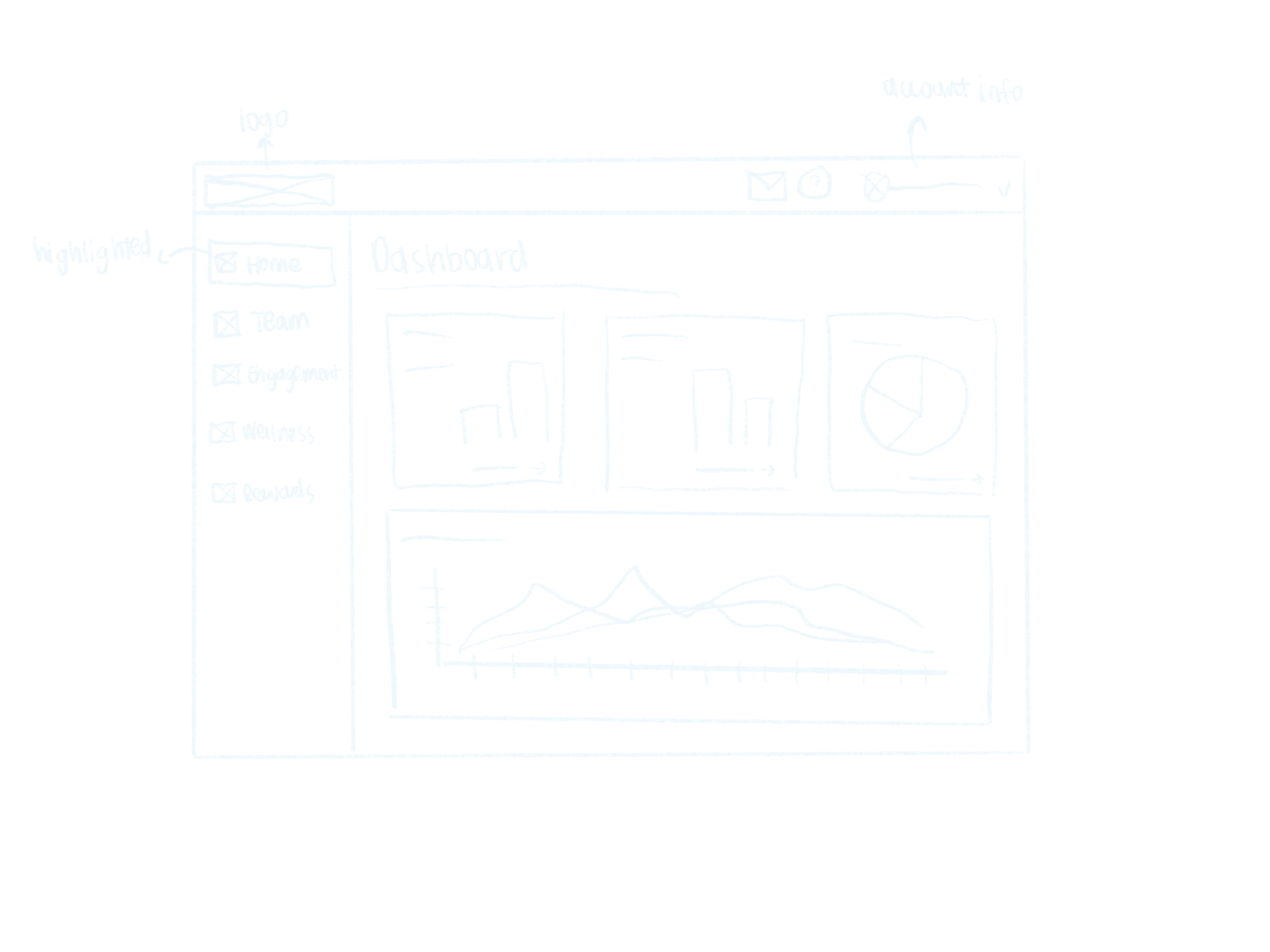
Sketches
Sketches
Sketches
I drew some sketches to get an idea on how the data will be organized and determine which layout makes the data easily digestible
Dashboard Home
My Team
Dashboard Home
My Team
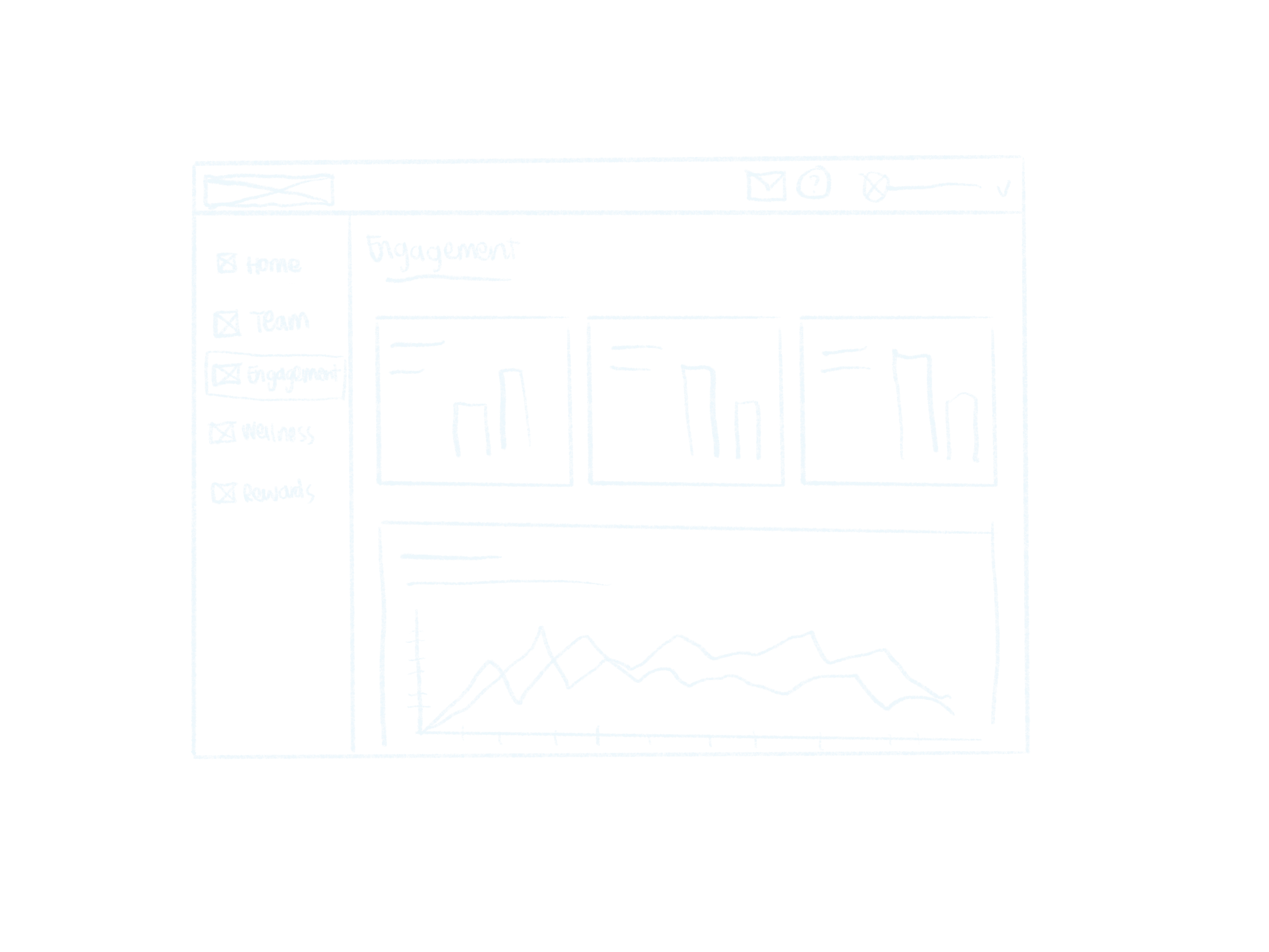
Engagement
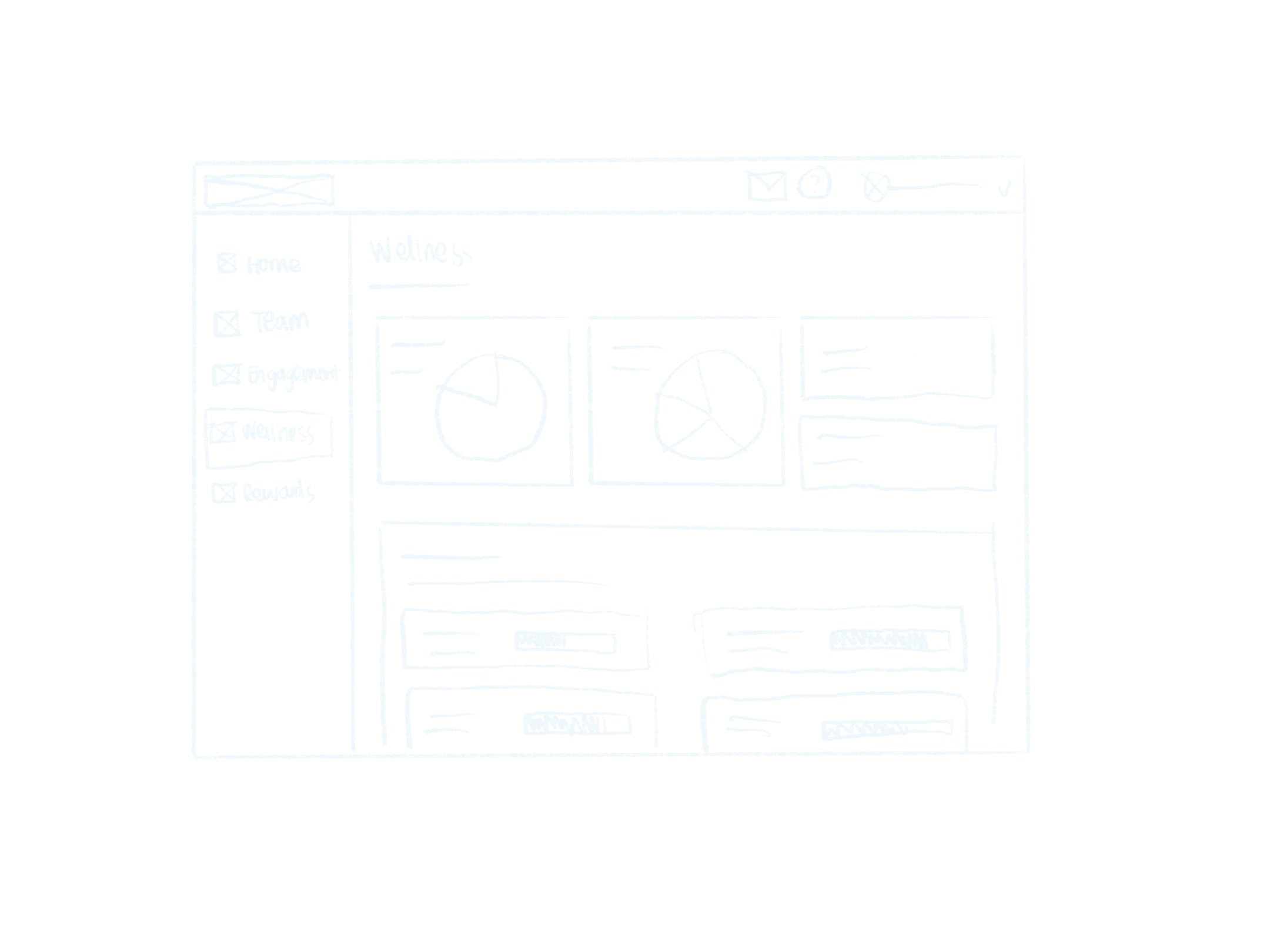
Wellness
Engagement
Wellness
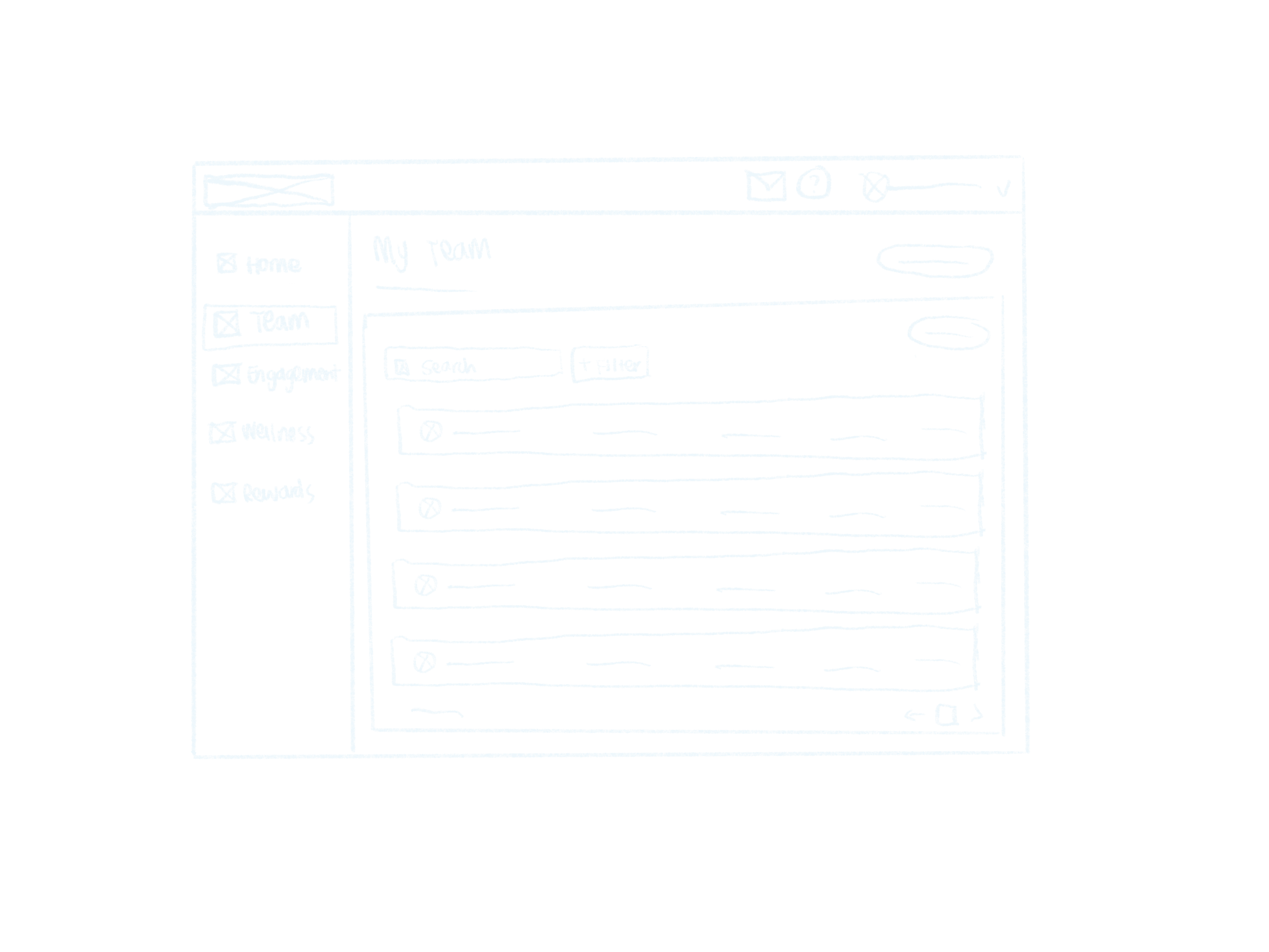
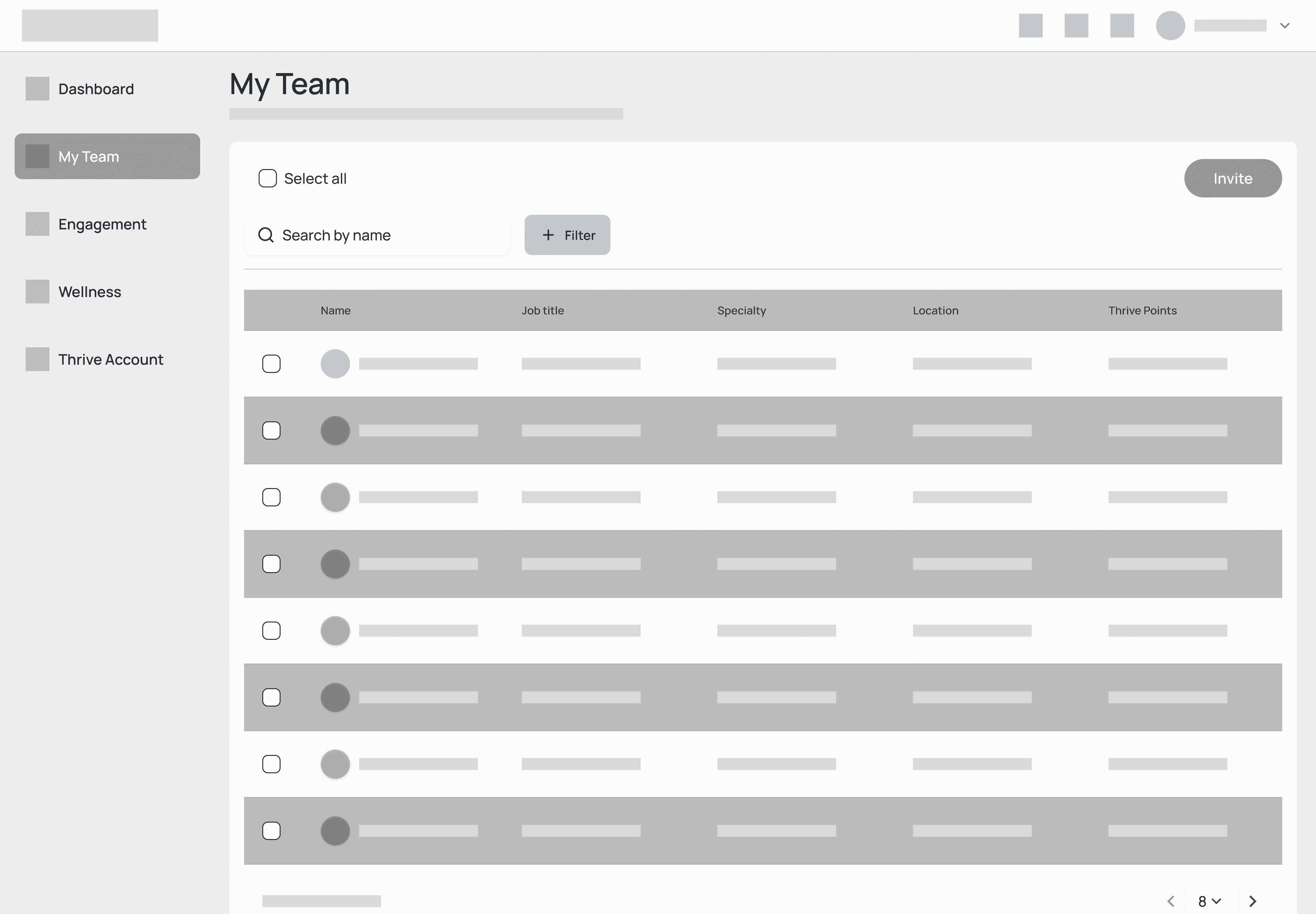
Mid-fidelity wireframes
Mid-fidelity wireframes
Mid-fidelity wireframes
I proceeded to create mid-fidelity wireframes to explore different layout ideas and iterate quickly.

Addressing Overwhelming Data
Addressing Overwhelming Data
For our personas, the following design solutions specifically targets data overload and complexity:
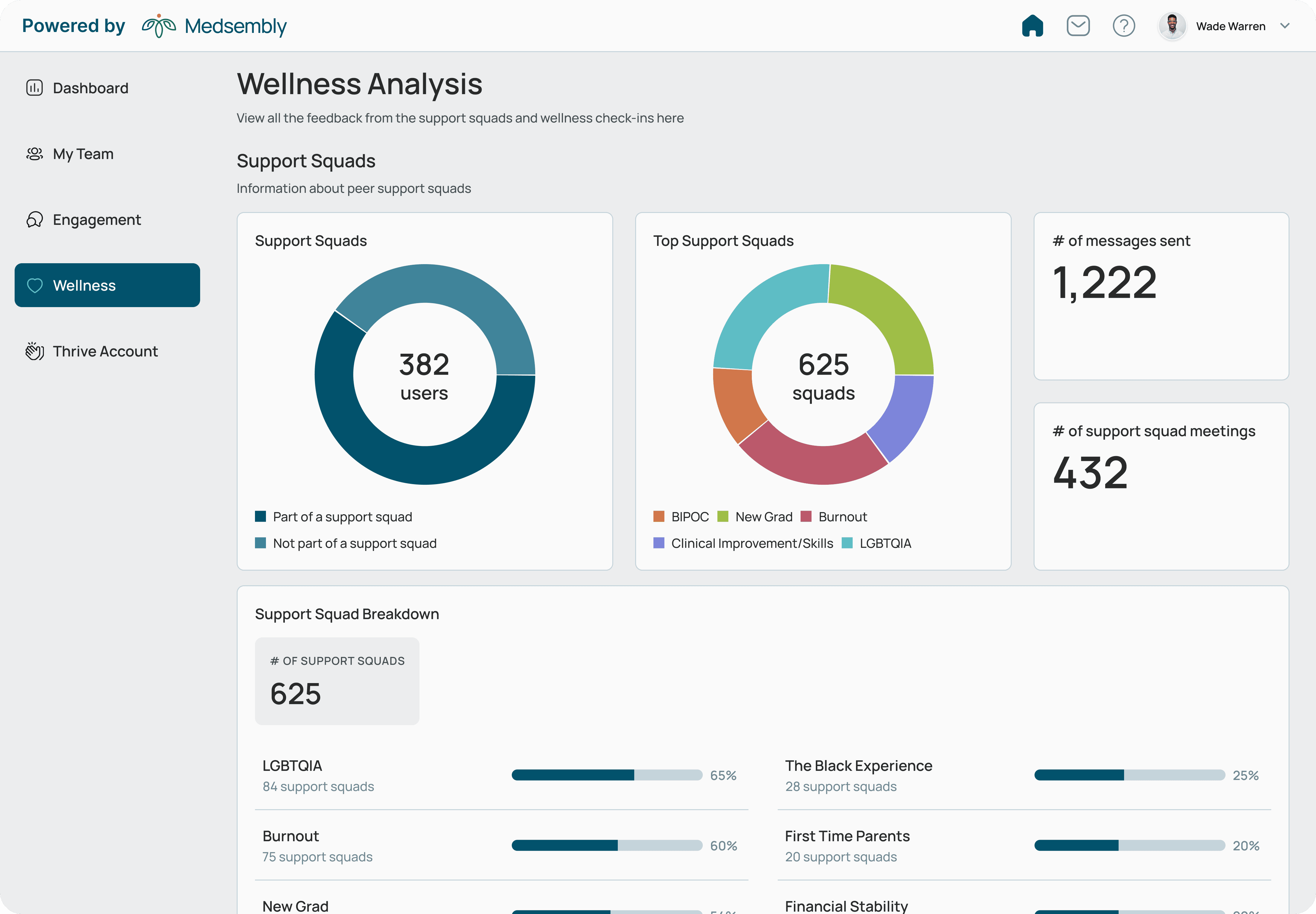
Data overload and complexity
SOLUTION
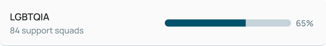
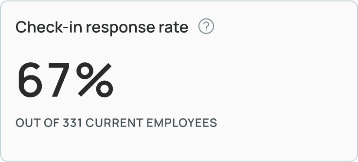
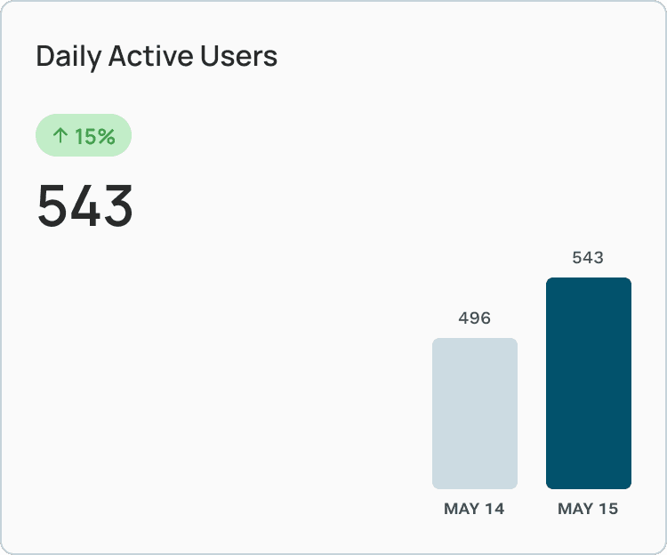
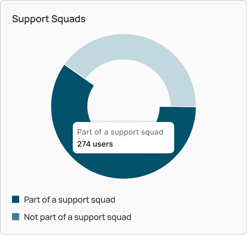
Comprehensive data visualization
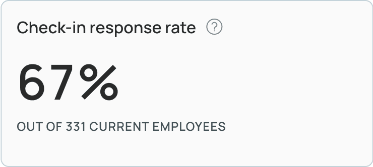
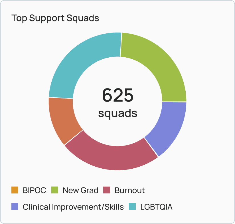
Data complexity can be overcome by presenting a comprehensive overview of employee wellbeing through intuitive charts and graphs to highlight key trends and metrics.
How it will help Kim and Carlos: Kim and Carlos use the web app to view data from employees' use of the wellbeing app. They can easily interpret the data, identify trends, and make informed decisions regarding employee wellbeing.
Data overload and complexity
SOLUTION
Comprehensive data visualization
Data complexity can be overcome by presenting a comprehensive overview of employee wellbeing through intuitive charts and graphs to highlight key trends and metrics.
How it will help Kim and Carlos: Kim and Carlos use the web app to view data from employees' use of the wellbeing app. They can easily interpret the data, identify trends, and make informed decisions regarding employee wellbeing.
Data overload and complexity
SOLUTION
Focusing on user needs and keeping it simple
The dashboard provides insights that are in line with the specific needs and goals of the employers who will be using the product. By breaking down the metrics into different blocks makes the data easy to read and scan through.
How it will help Kim and Carlos: The intuitive charts and graphs provide Kim and Carlos a clear picture of the employee wellbeing. The segmented presentation of the metrics allow them to quickly grasp the most relevant information.
Data overload and complexity
SOLUTION
Interactive and user-friendly interface
Adding interactive elements such as filters and hovers allows users to explore the data in detail. The navigation side bar is allocated to the main categories important to the users.
How it will help Kim and Carlos: Kim and Carlos can quickly located and analyze relevant information using the sidebar navigation.


Data-driven dashboard for employee well-being
Data-driven dashboard for employee well-being
View gallery


Next Steps
Following the design and development phase of this dashboard, the next steps would be to undergo thorough testing to gather feedback from potential users, including employers and HR professionals to ensure the dashboard meets their needs and is user-friendly.
Next Steps
Following the design and development phase of this dashboard, the next steps would be to undergo thorough testing to gather feedback from potential users, including employers and HR professionals to ensure the dashboard meets their needs and is user-friendly.

Visual is Power
Visual is Power
While designing this dashboard, I have learned the importance of visual and data hierarchy. A designer must clearly understand the needs and goals of the users to create a dashboard that is useful and effective.
While designing this dashboard, I have learned the importance of visual and data hierarchy. A designer must clearly understand the needs and goals of the users to create a dashboard that is useful and effective.
What's next
What's next
Budgetwise
Enhancing user experience by integrating AI for a budgeting app
FINTECH
B2C
MOBILE
Budgetwise
Enhancing user experience by integrating AI for a budgeting app
FINTECH
B2C
MOBILE
Miru
Designing a social app that tracks watchlist and connects communities
SOCIAL
B2C
MOBILE
Miru
Designing a social app that tracks watchlist and connects communities
SOCIAL
B2C
MOBILE